First Impressions of Brighter Shores: A Promising Start
Published in Feedback on November 6th, 2024
Edit: I have finally posted my full review about Brighter Shores in Early Access, read it here.
Brighter Shores has been out for just over an hour, and as expected, the servers are already down. Typical for any big launch day, but I'll give it an hour or two to stabilize. In the meantime, it's the perfect opportunity to jot down some initial thoughts from my first hour in the game.
First off, I had to see if I could grab my real name (Ryan) as my in-game username. For those unaware, you can claim any username you want, but if you haven't bought the Premium Pass, you'll have a discriminator attached, like Ryan#4 instead of just Ryan. So, I upgraded to the Premium Pass to secure the plain "Ryan," only to find it taken. Oh well, onto my classic username "Unseen"—and as a backup, I managed to grab "Username" and "Ivysaur." Not bad, given you're allowed up to three characters per Steam account.
With the names settled, I logged in with my main character, "Unseen," and jumped into the game. Right off the bat, I was impressed by how smooth everything felt. The mechanics aren't clunky or awkward; it's a polished experience right from the start. I do have a couple of small preferences for updates. For example, I'd love to see the option to turn the camera with WASD instead of being limited to the arrow keys. This would save some awkward hand movement, especially since one of the main abilities, "Sense," uses CTRL + S, forcing my hand all the way to the left of the keyboard before shifting over to the arrow keys. Fortunately, I mapped arrow keys to my mouse, so I can bypass this, but it would be nice to see an improvement here.
The dialogue is classic Gower style—those who've played RuneScape will know the vibe I'm talking about. It's witty, a bit dry, and the quest prompts are short and straightforward. It has that nostalgic charm I'd hoped for. Normally, I'm not big on game lore, but here I actually want to read through every bit of text; it's part of what makes Brighter Shores feel special.
Now, for the audio... well, there isn't any at the moment. There seems to be a bug that's preventing sound from playing, and I've seen a few other players report the same issue. Hopefully, this gets fixed soon. I'd really like to experience the full audio design, music, and all the little sound effects that would bring the world to life. Update: I have restarted my computer and that fixed the audio issue.
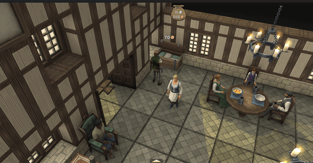
Gameplay-wise, I'm having a great time so far. It's simple but exactly what I was hoping for: straightforward and satisfying. The combat system is a familiar, OSRS-style click-to-attack mechanic, where you pick an enemy, choose your combat style, and then trade blows until someone drops. Outside of combat, your health regenerates automatically, which is a nice touch since it keeps you moving without needing food constantly. Potions are available for in-combat healing, so there's still an element of strategy there. And the loot? Pretty generous so far. I've scored a few common (green) items, a uncommon (blue) sword, and even a rare (purple) pair of gloves just off the training Guards.
All in all, I can't wait to dive back in once the servers are up and explore Hopeport further. This game is already shaping up to be something I'll be spending a lot of time on. Kudos to Andrew (𝕏) and the team for what's already a memorable experience. Here's to a bright future with Brighter Shores!
You Might Also Like
Recent News
 Fen Research & Brighter Shores: Andrew Gower's Final Joke
 Herbalist's Hurdle Quest Launch
 Weekly Leek #2
 Weekly Leek #1
 Brighter Shores Easter Event (2025) - All 128 Hidden Egg Locations
 2nd April 2025 - Easter Event
 Teloril Breaks Down the Online Safety Act and Its Impact
 Easter Event, Team Expansion, and Upcoming Game Updates
